Daground: A Bold Display Font for Digital Branding
As a UI designer who ships landing pages, SaaS dashboards, and conversion-optimized e-commerce sites, I pay close attention to how typefaces shape first impressions—and Daground consistently delivers strong visual impact without sacrificing clarity. It’s a display font built for moments that need personality: hero headlines, product launch banners, brand logotypes, and high-energy digital experiences like esports platforms or retro-themed course sales pages.
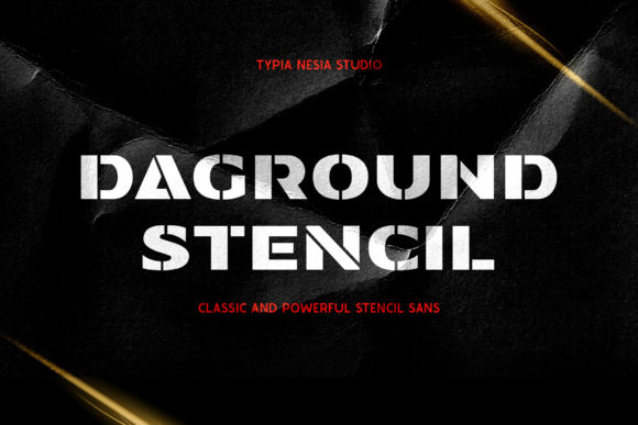
Visually, Daground balances 80s-inspired geometry with clean, confident letterforms. Its uppercase-heavy structure, subtle angular terminals, and consistent stroke contrast give it presence at large sizes—yet it avoids the fragility many retro fonts suffer from on screen. Unlike overly distressed or pixelated alternatives, Daground renders crisply across modern browsers and devices. That matters when your hero section needs to load fast and look sharp on both a 27-inch monitor and an iPhone 15 Pro.
In practice, I use Daground for short, high-intent text elements: primary headlines (H1), CTA buttons (“Get Early Access”, “Join the Race”), logo lockups, and section dividers in portfolio sites. It’s not intended for body copy—but that’s by design. As a display font, its strength lies in establishing tone quickly and anchoring visual hierarchy. When paired with a neutral sans serif like Inter, Poppins, or Manrope for paragraphs and interface labels, Daground becomes the voice of your brand—while the supporting font handles legibility and scanning behavior.
On landing pages, I’ve seen Daground lift conversion rates—not because it’s “cool,” but because it signals intention. A fintech startup using Daground for their headline (“Build Wealth, Not Just Budgets”) immediately conveys confidence and forward motion. A boutique online store selling vintage sneakers uses it for category banners (“Retro Runners”, “Track & Field Classics”)—reinforcing theme without needing imagery. In both cases, users grasp context faster, reducing cognitive load before they even read the subhead.
For responsive layouts, I apply Daground selectively. On desktop, it shines at 48–96px for hero titles. On mobile, I cap it at 36px and ensure line-height stays generous (1.2–1.3) to preserve spacing between letters. It performs well over dark backgrounds—especially with subtle text-shadow or background contrast tweaks—but avoid thin weight variants on low-light UIs unless you’re using it purely decoratively. For image overlays, I always test readability at 75% opacity backgrounds; Daground’s bold structure holds up better than most script or handwritten fonts here.
Readability isn’t just about size—it’s about rhythm and recognition. Daground’s distinct “D”, “G”, and “R” shapes create memorable anchors in scanning behavior. Users don’t read every letter; they recognize patterns. That makes it effective for logos and app icons where instant recall matters. But it’s not ideal for navigation menus, form fields, or small-label interfaces—those still need functional, highly legible type. Reserve Daground for moments where you want users to pause, register tone, and feel aligned with your brand’s energy.
Font pairing is where Daground truly earns its place in my toolkit. I pair it almost exclusively with humanist or geometric sans serifs for web interfaces—never with other display or decorative fonts. Why? Because contrast creates clarity. Daground brings character; the sans serif brings calm. For editorial-focused digital products—like a design blog or newsletter—I’ll occasionally layer it with a restrained serif (e.g., Lora or Literata) for section headers, keeping body copy in a highly readable variable sans. The result feels intentional, not chaotic.
Before integrating Daground into a live site, I check three things: webfont format support (WOFF2 preferred), included weights (I rely on Bold and ExtraBold for most use cases), and multilingual coverage. The version I use includes Latin Extended-A, covering Western and Central European languages—enough for most SaaS, e-commerce, and creator-facing projects. If you’re building for global audiences beyond that range, verify glyph support early. Also note: Daground doesn’t include true italics or stylistic alternates, so plan emphasis through weight shifts or color—not slant.
Licensing is non-negotiable. Daground is a commercial font, and its license covers web use—including self-hosted sites, client projects, Shopify themes, and digital templates—as long as you’ve purchased the appropriate tier. I never embed unlicensed fonts in production. Doing so risks legal exposure and inconsistent rendering if the font fails to load. Always serve it via your own CDN or a trusted font host with proper CORS headers, and include a system-font fallback (e.g., sans-serif) in your CSS stack.
I’ve used Daground across diverse digital contexts: a racing sim’s dashboard UI (where its speed-inspired geometry mirrors interface motion), a creative agency’s portfolio site (as animated section headers that scale on scroll), and a wellness coach’s course sales page (to convey energetic transformation without cliché). In each case, it reinforced brand identity—not by shouting, but by aligning visual language with audience expectation.
What sets Daground apart from other display fonts isn’t novelty—it’s reliability. It doesn’t require workarounds to look good on screen. It doesn’t sacrifice usability for style. And it scales meaningfully across touchpoints: from a favicon-sized logo mark to a full-screen banner. That consistency builds trust. When users see the same confident, rhythmic typography across your website, email headers, and social ads, they’re not just seeing a font—they’re recognizing a cohesive digital identity.
If you’re selecting a display font for your next web project, ask yourself: does it serve the user’s intent *and* the brand’s voice? Does it hold up in context—not just in a specimen PDF? Does it integrate cleanly into your existing type system? Daground answers yes—to all three.